
Using Your Proposal Pipeline Dashboard
The Proposal Pipeline dashboard is designed to help you review all proposals or opportunities currently in the gift pipeline. You can use it to identify proposals that need attention and to forecast fundraising outcomes.
Dashboard Elements
Proposal Pipeline has four important elements to help you evaluate the pipeline of major gift proposals:
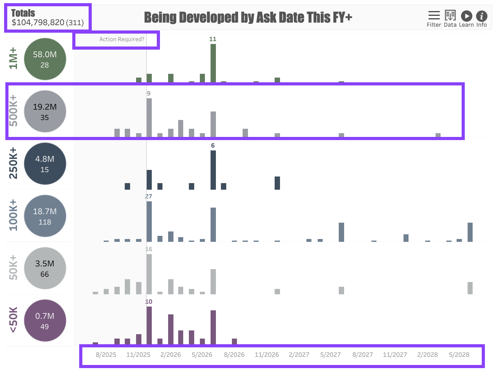
In the upper left corner of the dashboard is a Proposal Summary totaling the Dollar Value of all proposals in the dashboard. Next to the dollar amount is a Count of the proposals included in the dashboard.
Your dashboard may contain a shaded section that is marked Action Required. Proposals in this section may need your attention. When viewing proposals in the Being Developed stage, this section will highlight the proposals where the planned Ask Date is in the past. When viewing proposals in the Pending Response stage, this section will highlight proposals that have been pending for 18 months or longer.
The dashboard shows Tiers of proposals organized by Ask Amount. For example, if the ask amount is between $500,000 - $999,999, the proposal will appear in the $500K+ tier. Each tier is marked with a circle showing the total dollar value and count of the proposals in the tier.
At the bottom of the dashboard is a Timeline representing either the Ask Date or the Expected Date, depending on your filter selection.
Dashboard Filters
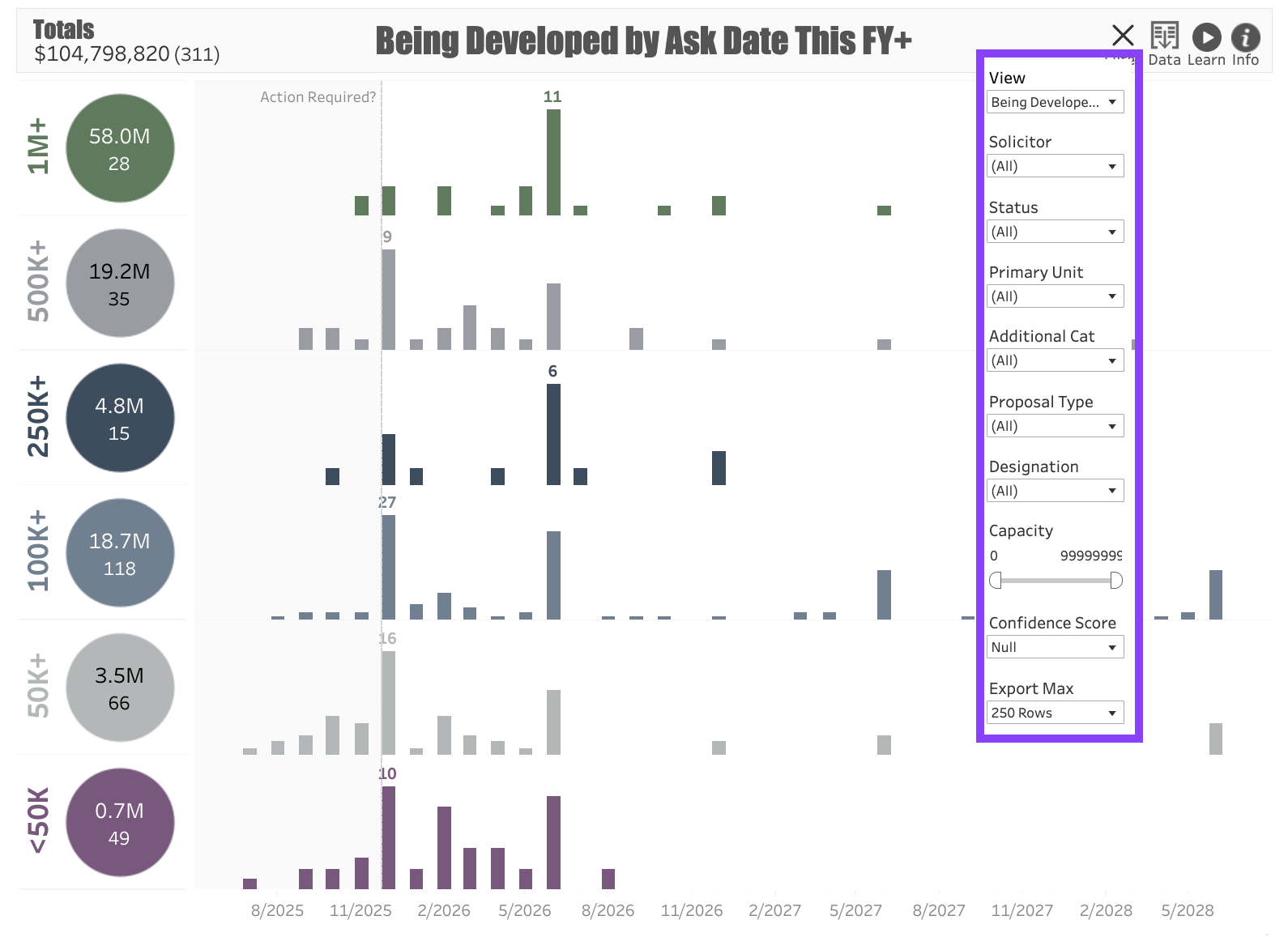
Use the following Filters to customize your dashboard:
View: This filter will allow you to choose many different options for displaying the Pipeline. Note that there are five categories:
Being Developed: Proposals that are in the planning stage.
Pending Response: Proposals where the ask has been made but the prospect has not responded.
Open: A combination of Being Developed and Pending proposals, indicating everything that is in the pipeline.
Approved: Shows the proposals that have been approved.
Declined: Shows the proposals that have been declined.
Solicitor: The fundraiser assigned to the proposal.
Status: Allows you to filter out either Active or Inactive proposals.
Primary Unit: The program unit to which the proposal is allocated.
Additional Category: Can be used to further delineate proposals, such as categorizing them by Campaign.
Proposal Type: An additional category to separate types of proposals, such as separating them by central campus vs. college-based fundraising.
Designation: The fund to which the potential gift will be allocated.
Capacity: The prospect’s Gift Capacity, expressed as a range.
Confidence Score: Allows you to filter proposals based on their confidence score, if known.
Export Max: If you plan to download the results and have more than 250 proposals in the dashboard, use this to expand the number of rows you can export. The maximum number of rows is 1,000.
Use Cases
Your dashboard views are interactive, made up of clickable and hoverable elements that enable thorough data analysis. Together, dashboard views and filters allow for endless experimentation, customization, and creativity.
Below, we offer a few ways you can strategically use the Proposal Pipeline dashboard, but we encourage you to spend time exploring the dashboard in your own time!
Campaign Pipeline
You're a campaign manager who wants to see all of the active proposals in the campaign pipeline.
Overdue Asks
You’re a prospect management professional who wants to help your colleagues address the overdue proposals in the pipeline.
Proposal Review
You are a fundraiser who wants to review all of the proposals you’re managing in the pipeline.
These are just some of the ways you can use the Proposal Pipeline dashboard to better understand your fundraising performance. Let us know how you’re using it!
For any other questions, reach out to EverTrue Support at genius@evertrue.com.
Reply
Content aside
- 6 mths agoLast active
- 22Views
-
1
Following