
Using Your Donors by Fiscal Year and Month Dashboard
Note: Clarity’s Donors by Fiscal Year and Month dashboard is a feature of Signal by EverTrue. If you have questions about Signal, please reach out to your Customer Success Manager (CSM).
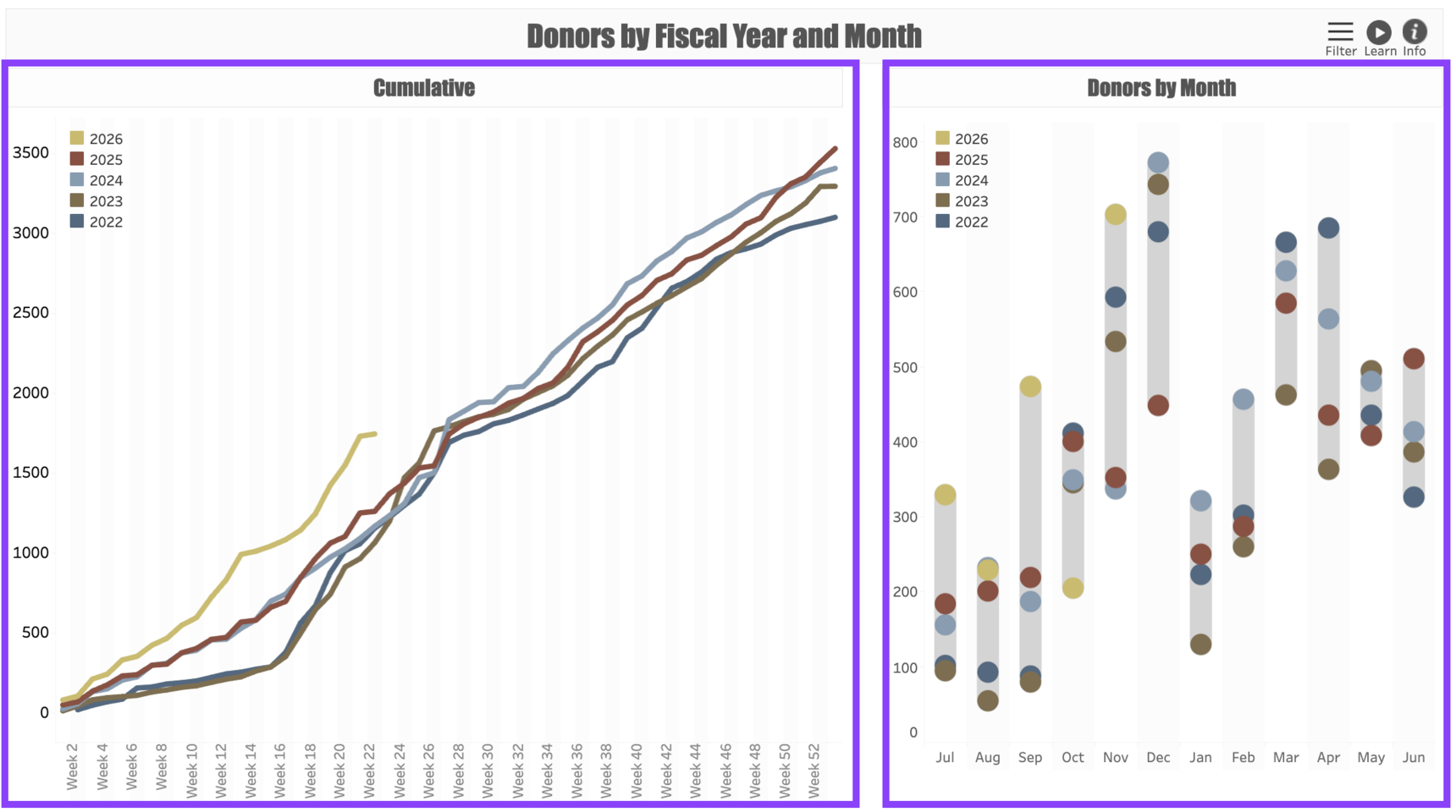
Donors by Fiscal Year and Month is a simple yet powerful dashboard that allows you to track year-over-year donor population trends in real time, giving you a better understanding of how your donor participation rate stacks up against prior years. Note that the dashboard counts All Donors, regardless of gift credit, and that it measures participation through Received giving (gifts and pledge payments, but not pledges).
Dashboard Views
Donors by Fiscal Year and Month has two views:
The Cumulative view shows the cumulative donor participation rates on a week-by-week basis. Hovering over any point on the line shows a tooltip that compares this particular week with other years as well as the overall yearly cumulative performance by this week. The count of each week (Week 1, Week 2, etc.) begins on the first week of your organization’s fiscal year.
The Donors by Month view gives you the total donor participation on a monthly basis, which helps to smooth out the minor spikes and dips that might occur week by week. Hovering over any dot will show you how that particular month performed according to the Channel of giving.
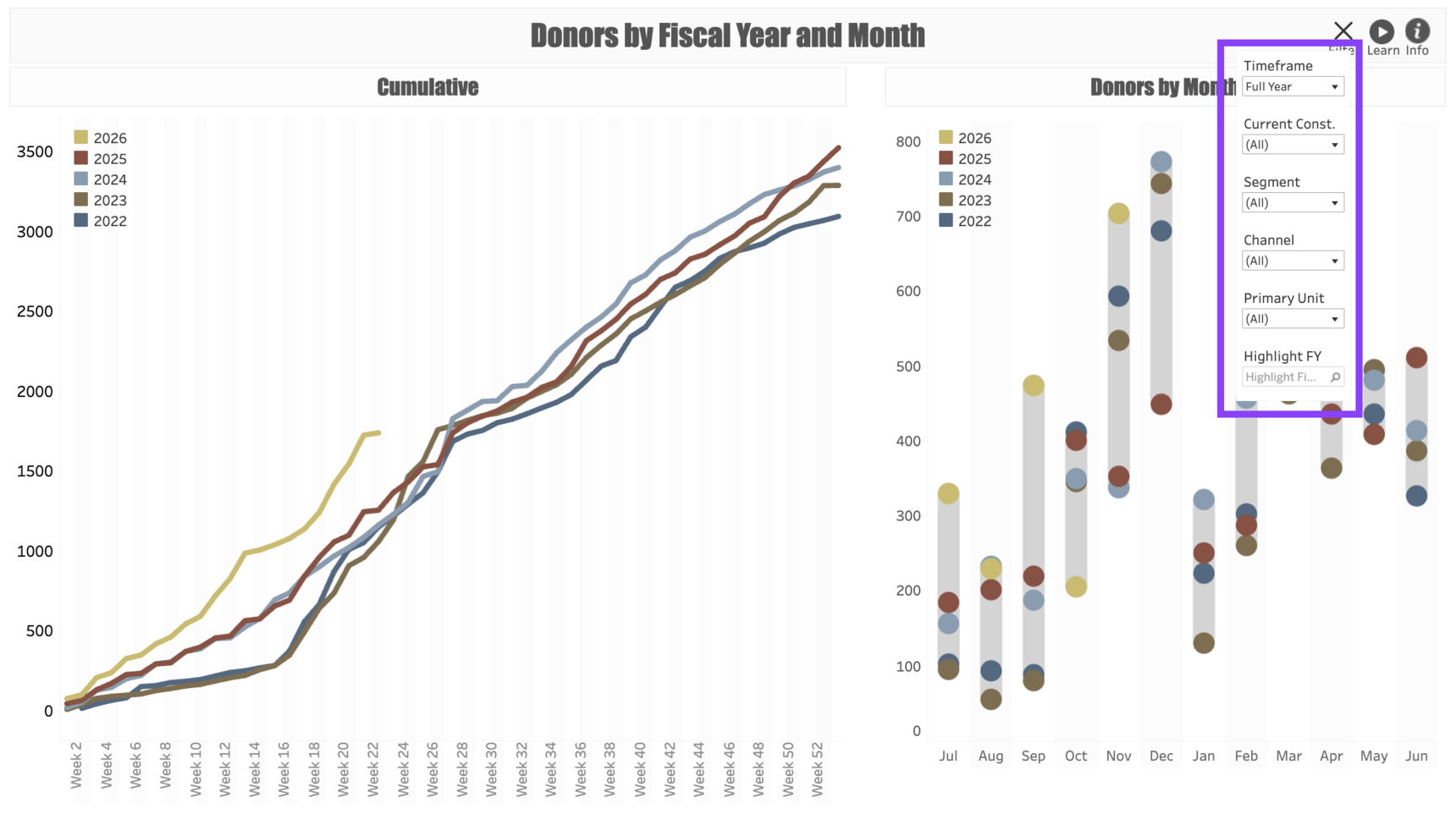
Dashboard Filters
Use the following Filters to customize your dashboard:
Timeframe: This filter allows you to choose between the Full Fiscal Year and a Year-to-Date view. The year-to-date view will automatically give you a more precise (to the day) comparison of how each year's giving compares.
Current Constituent: Allows you to filter the donors according to their Primary Constituent Type. Please note that all constituents are represented by their Current Type as of the date the report is run, which may have changed over years past.
Segment: Allows you to filter the dashboard by Annual Giving Segment such as LYBUNTs.
Channel: Allows you to filter the dashboard by the Channel through which the donors made their gift (Phone, Mail, etc.).
Primary Unit: Use this to select the fundraising program category associated with the gift. For example, you can use this to select only gifts to a specific Campaign.
Highlight FY: Allows you to highlight a specific year within the dashboard so you can see more vividly how it compares to other years.
Use Cases
Your dashboard views are interactive, made up of clickable and hoverable elements that enable thorough data analysis. Together, dashboard views and filters allow for endless experimentation, customization, and creativity.
Below, we offer a few ways you can strategically use the Donors by Fiscal Year and Month dashboard, but we encourage you to spend time exploring the dashboard in your own time!
Alumni Giving
You're responsible for alumni relations and annual giving, and you would like to see how the Alumni Participation rate has changed over time. (Note that this number may be imprecise due to yearly changes in donors’ alumni status.)
Segment Growth
You are an annual giving director and would like to see how various Annual Giving Segments are performing.
These are just some of the ways you can use the Donors by Fiscal Year and Month dashboard to better understand your fundraising performance. Let us know how you’re using it!
For any other questions, reach out to EverTrue Support at genius@evertrue.com.
Reply
Content aside
- 6 mths agoLast active
- 18Views
-
1
Following