
Using Your Annual Giving Summary Dashboard
The Annual Giving Summary dashboard is designed to help you compare the year-to-date performance of your annual giving program to the performance last year.
Dashboard Elements and Views
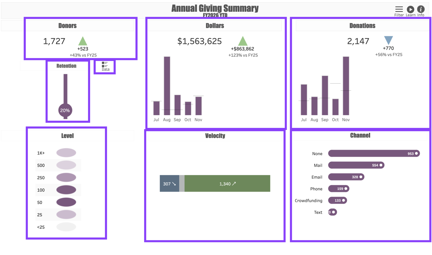
Annual Giving Summary has eight elements and views to help you deepen your understanding of your annual giving performance.
In the upper left corner of the dashboard is a Donor Count. This provides a headcount of all Credited Donors whose giving matches the filter criteria. Next to the number of donors is a triangle showing the Change between this year and last year.
In the top center of the dashboard is a Dollars total. The dollars you see are the Gifts Received that match your filter criteria. Next to the total dollar amount is a triangle showing the Change compared to the prior year. Beneath that is a monthly bar chart. The current year’s dollars are represented by purple bars, and the monthly giving for the prior year is represented by a gray line.
At the top right corner is a Donations total, alongside a triangle representing the Change in the number of donations since last year.
On the left side beneath the donor count is a Retention visualization. The percentage represented in the view is the percentage of current year donors who were also prior year donors.
Immediately to the right of the Retention view is a button marked Data. This button is where you can view and download transaction data related to the report. See Filters for more information about how to utilize the data button.
The Level view shows the distribution of donors by giving tier. Because this dashboard is focused on annual giving, the top giving level is $1,000. Note that if a donor makes four gifts of $25 so far this fiscal year, their giving will be attributed to the $100 level.
The Velocity view shows the number of donors whose giving has Increased, Decreased, or Stayed the Same since the year before. Increases are represented in green, decreases in blue, and maintained giving levels are shown in gray. The numbers in each section correspond to the number of donors in the dashboard.
The Channel view shows the number of donations that have been received through various giving channels, such as Mail or Phone.
Interpreting the Numbers
The numbers in this dashboard represent Received Giving, meaning that the dollars include Gifts and Pledge Payments but exclude Pledges. The Donor Counts include all Credited Donors, whereas the Dollars and Donations totals only count the Legal Gifts.
Example: A married couple gives as a household to the organization. In response to a telefund call, they pledge to give $100 each month, which is more than they gave last year. You run the dashboard in the third month of the fiscal year. Here is how they will be counted in the dashboard:
Donors: They will count as two donors, one Legal and one Soft Credit.
Dollars: Their gift will add $100 to each bar representing the first three months, and they will contribute $300 overall to the Dollars total.
Donations: Their giving will count as three Donations year-to-date. At the end of the year, they will have made a total of 12 donations.
Retention: Because they gave last year, they will be included among the Retained donor percentage.
Level: So far, they have given $300 in the current year, so they will be counted at the $250 level. As their giving increases each month, they will begin to move up to higher levels.
Velocity: They will be counted as two donors who have Increased their giving.
Channel: Because they made their pledge by phone, they will be counted as two donors within the Phone channel.
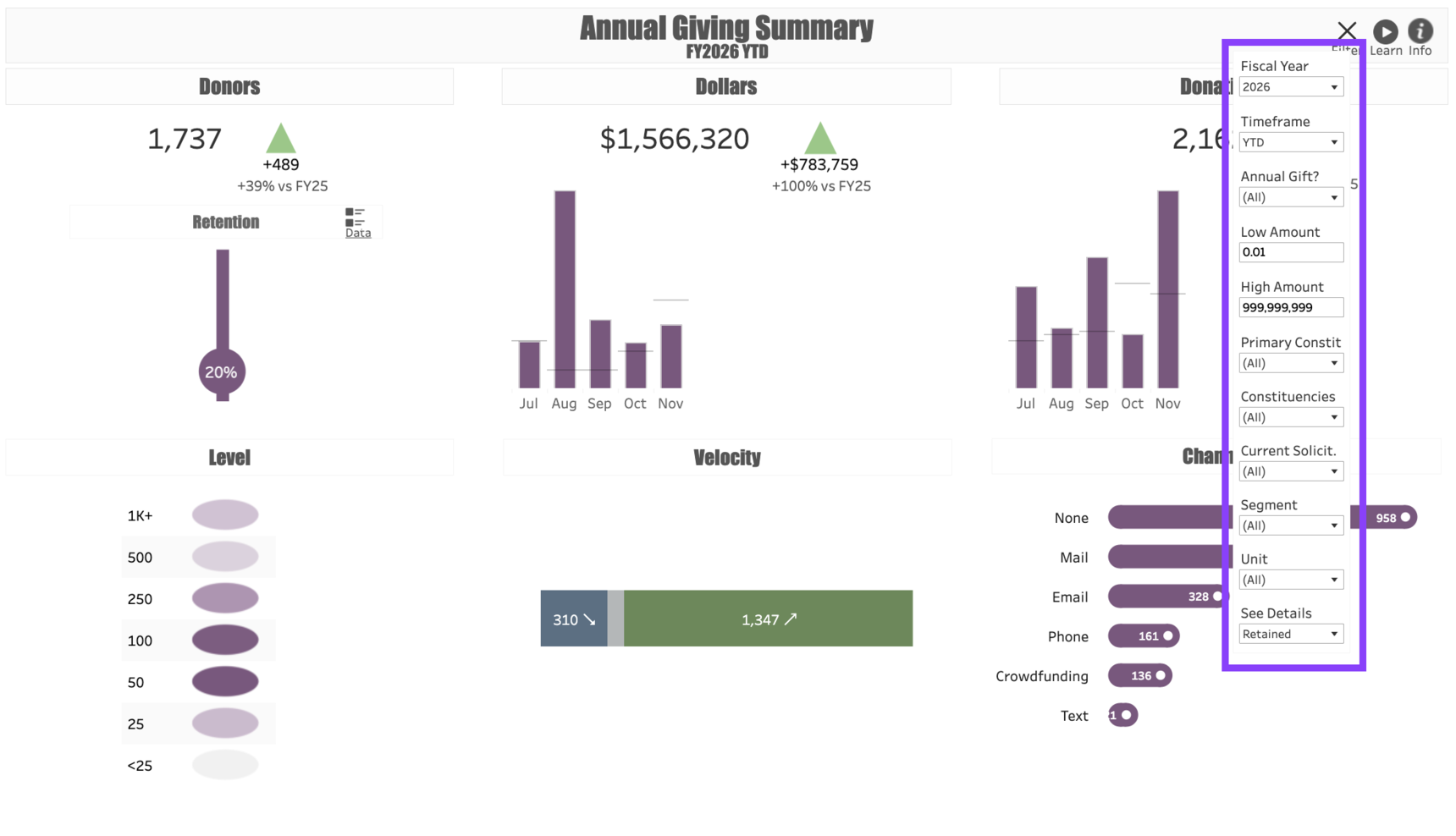
Dashboard Filters
Use the following Filters to customize your dashboard:
Fiscal Year: This represents the fiscal year you would like to measure. Regardless of what year you put in this filter, the dashboard will compare it to the year prior. For example, if you enter “2020” in this filter, the report will show FY 2020 numbers compared to FY 2019.
Timeframe: This allows you to change the dashboard from a Year-to-Date view to a Full Fiscal Year view. Note that if you do this, your current year numbers may look dramatically lower than those from the prior year, as the prior year will include a full twelve months.
Annual Gift?: Customers may wish to use a Y/N indicator in their Gift File to flag all the transactions they consider part of the annual giving program. If they do this, this filter will allow you to isolate annual gifts from all other gift activity.
Low Amount: The lowest level of gift that will be included in the dashboard.
High Amount: The highest level of gift included in the dashboard. You can leave the High Amount as a series of 9s to indicate there should be no upper limit, or you can cap the dashboard to only show gifts below a specified amount.
Primary Constituent Type: This allows you to choose the constituent types you wish to include in the dashboard. For example, some annual giving programs only track gifts from Individuals, in which case you can filter out Organizations.
Constituencies: Allows you to further refine the constituents included in the dashboard. For example, if you want to include all Alumni, including those whose Primary constituent type is Faculty/Staff, you can refine your search here by selecting Alumni | Faculty/Staff.
Primary Solicitor: This filter allows you to include or exclude constituents who are assigned to specific fundraisers.
Segment: This filters the dashboard results to donors who are within the specified Annual Giving Segments in the current (or report) year. For example, filtering by Acquisition will show the current year’s newly-acquired donors as compared with the prior year’s newly-acquired donors.
Unit: Limits the dashboard results to gifts designated to one or more specific program units.
See Details: This filter allows you to customize the Data download to showing only Retained donors, only Lapsed donors, or Both. Choose your preferred filter here prior to clicking on the Data button.
Use Cases
Your dashboard views are interactive, made up of clickable and hoverable elements that enable thorough data analysis. Together, dashboard views and filters allow for endless experimentation, customization, and creativity.
Below, we offer a few ways you can strategically use the Annual Giving Summary dashboard, but we encourage you to spend time exploring the dashboard in your own time!
New Donor Acquisition
You manage the annual giving team, and you have an annual goal to acquire new donors who are individuals giving up to $25,000. You would like to see how you are doing so far when compared to last year.
Upgrade Analysis
You would like to determine what channels are most effective at upgrading donors.
LYBUNT List
You are a fundraiser who wants to contact any of your donors who are LYBUNTs to encourage them to make an end-of-year gift.
These are just some of the ways you can use the Annual Giving Summary dashboard to better understand your fundraising performance. Let us know how you’re using it!
For any other questions, reach out to EverTrue Support at genius@evertrue.com.
Reply
Content aside
- 6 mths agoLast active
- 16Views
-
1
Following