
Using Your Signal Activity YOY Dashboard
Note: Clarity’s Signal Activity YOY Dashboard is a feature of Signal by EverTrue. If you have questions about Signal, please reach out to your Customer Success Manager (CSM).
Clarity’s Signal Activity YOY dashboard uses imported interaction data and Signal Cadences and Collaborative Tasks data to provide detailed insights into your year-over-year outreach efforts. This dashboard serves as the go-to tool for your fundraising team to chart individual progress and track team-wide trends. It also empowers you to benchmark your performance against that of your teammates, opening the door for collaboration and growth!
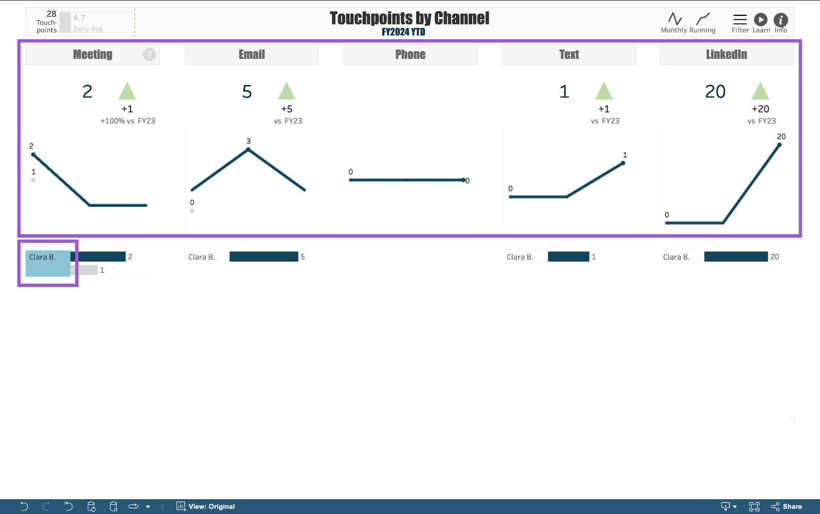
When you open the Signal Activity YOY dashboard, you will find it divided into 5 views that correspond with the communication channels being tracked:
- Meeting: Tracks solicitor meeting activity, organized by overall team activity relative to the prior year and the relative activity level of each solicitor.
- Email: Tracks solicitor email activity, organized by overall team activity relative to the prior year and the relative activity level of each solicitor.
- Phone: Tracks solicitor phone call activity, organized by overall team activity relative to the prior year and the relative activity level of each solicitor.
- Text: Tracks solicitor text activity, organized by overall team activity relative to the prior year and the relative activity level of each solicitor.
- LinkedIn: Tracks solicitor LinkedIn activity, organized by overall team activity relative to the prior year and the relative activity level of each solicitor.
Below, we’ll take a closer look at the filters you can use to customize the data in these views. Then, we’ll focus on an example of how to use the dashboard to track outreach for a specific channel and benchmark performance against the previous year. Let’s get started!
Video Overview: Meet Your Signal Activity YOY Dashboard
Available Dashboard Filters
You can customize the Signal Activity YOY dashboard’s data using the following filters:
- Fiscal Year: Filter to solicitor touch point activity that took place in the selected fiscal year. Your dashboard will compare touch point activity from the selected year to the prior year. The current fiscal year is the default filter option.
- View: Filter to either year-to-date (“YTD”) or “Full Year” solicitor touch point activity. “YTD” is the default filter option.
- DXO Activity: Filter to only Donor Experience Officer (DXO) touch point activity (“Yes”) or to all other solicitor touch point activity (“No"). Use the default option “All” to include both DXO and other solicitor touch point activity in your dashboard views.
- DXO Status: This filter will primarily be used by DX teams to filter to either current or former DXO touch point activity. We recommend keeping this filter set to its default option of “All” if not part of a DX team.

Use Case: Tracking Meeting Outreach Activity
Your dashboard views are interactive, made up of clickable and hoverable elements that enable thorough data analysis. Together, dashboard views and filters allow for endless experimentation, customization, and creativity. Below, we will focus on one way you can strategically use the Signal Activity YOY dashboard, but we encourage you to spend time playing around with the dashboard in your own time!
Use case: How can I track meeting activity for members of my team who are not DXOs, and then compare this activity to the previous fiscal year?
Step 1. Apply Your Filters
Start by applying filters to your dashboard by clicking the Filter button in the top-right corner. You can adjust as many filters as you’d like! For this example, we will only change the DXO Activity filter to narrow down the solicitors in our views. Click this filter’s dropdown and select “No” from the available options to exclude DXO data. The dashboard will dynamically update to match this selection.

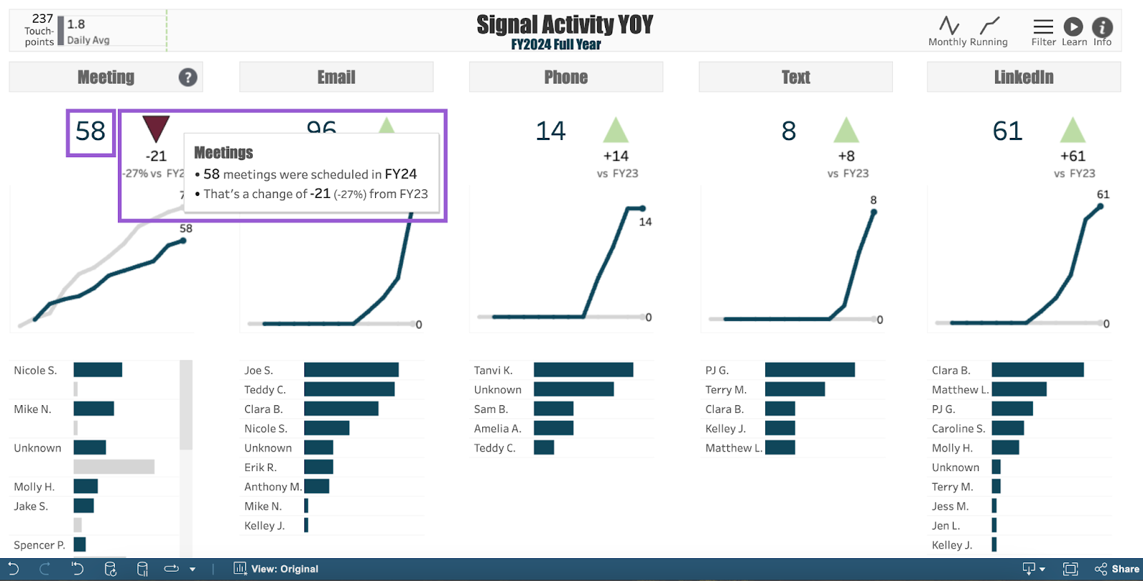
Step 2. Hover over Delta Arrow
Look to the dashboard’s Meeting view, where you’ll find a summary of your team’s overall meeting activity data represented by a single number. A delta arrow next to this number indicates the change in activity from the previous fiscal year. Hover over this arrow to see a more detailed overview of the change.
Step 3. Click a Line Graph Data Point
Beneath the delta, you’ll find a line graph tracking the running total of meeting activity compared to the prior year. The navy line represents engagement activity for the dashboard’s selected fiscal year. This defaults to the current fiscal year, but can be changed to prior years using your Filter button. The gray line represents engagement activity for the prior year.
When hovering over either line, dots representing monthly activity data appear. Click on one of these data points to see a summary of that particular month’s meeting total and a tally of the fiscal year’s meeting totals as of that month.
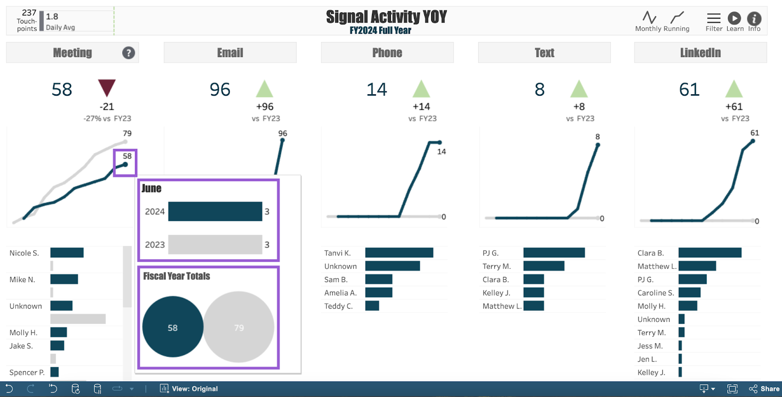
Note: In the upper-right corner of your dashboard, you’ll find an option to change the look of the communication channel line graphs. Click Monthly to view monthly activity totals, or click Running (this is the dashboard's default) to view running activity totals.
Step 4. Review Individual Solicitor Activity
After reviewing your team’s overall activity, look to the bottom half of your Meeting view to see bar charts that break down individual solicitor activity. Similarly to your line graphs, navy bars represent running totals of engagement activity for the dashboard’s selected fiscal year, whereas gray bars represent activity for the prior fiscal year. Solicitors are organized by the highest number of touchpoints for the selected year.
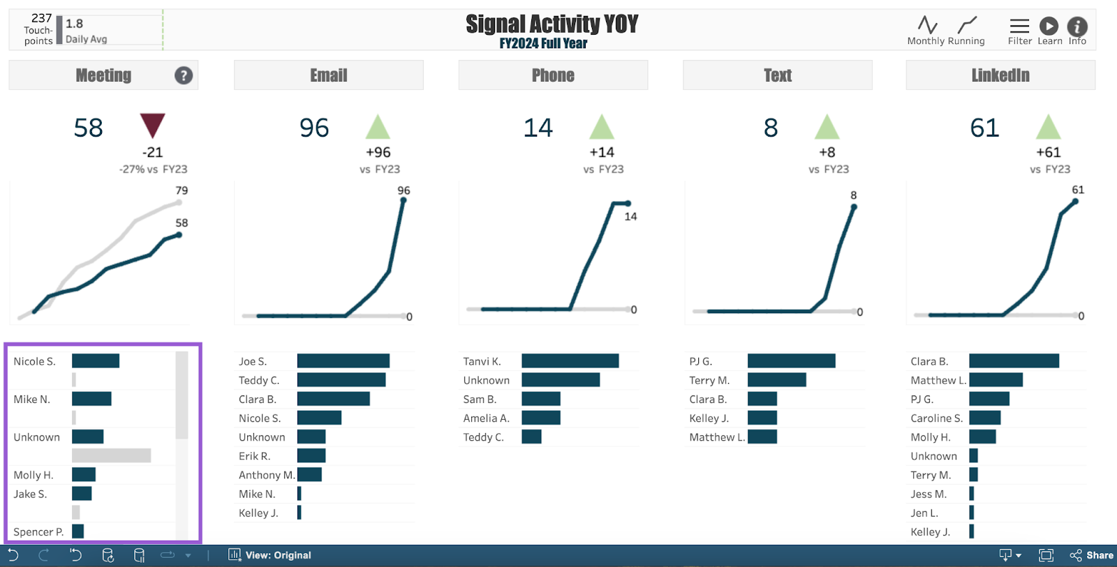
Note: Navy and gray bars appear when there is solicitor engagement activity. If a solicitor was not part of your team during the prior fiscal year, their gray bar will not be visible.
Hover over a solicitor’s navy or gray bar to view additional details about their meeting activity progress for the fiscal year.
Reviewing individual solicitor meeting activity enables you to benchmark your performance against that of your teammates! Use this dashboard to quickly gauge your own outreach progress, and connect with your colleagues to generate ideas for growth.
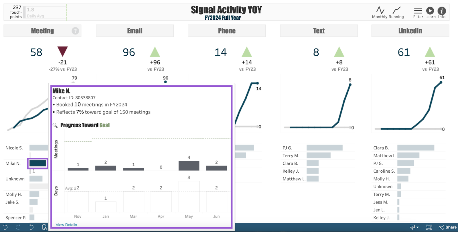
Step 5. Select a Solicitor Name
Each solicitor name in this view is clickable. Selecting one narrows down the focus of the entire dashboard. Click on a name to see all of the dashboard views adjusted to show summaries for that individual solicitor’s running performance. Now you can drill into their meeting activity (and all other channel activity) compared to the prior fiscal year!
That’s just one of the countless ways you can use your Signal Activity YOY dashboard to maximize your outreach data! Let us know how you’re using it!
For any other questions, reach out to EverTrue Support at genius@evertrue.com.
Reply
Content aside
- 8 mths agoLast active
- 247Views
-
1
Following